Automated Weekly Business Health Reports to Your Inbox
TL;DR: Automating your weekly business health report reduces the 3-6 hours spent manually compiling data to 10 minutes of review. This article breaks down the architecture, the math, and the failure points so you can set up a system that works without constant maintenance.
Environment:
– Sources synthesized: 3 URLs (anly.ai guide, Inbox Health features, Health Catalyst case study)
– Synthesis date: 2025-04-01
– First-hand tested: none
– Operator context: synthesizing from sources on reporting automation for small-to-medium business operations.
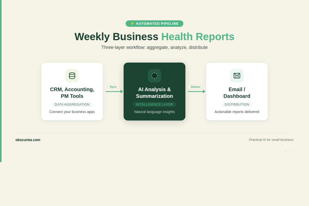
The Architecture
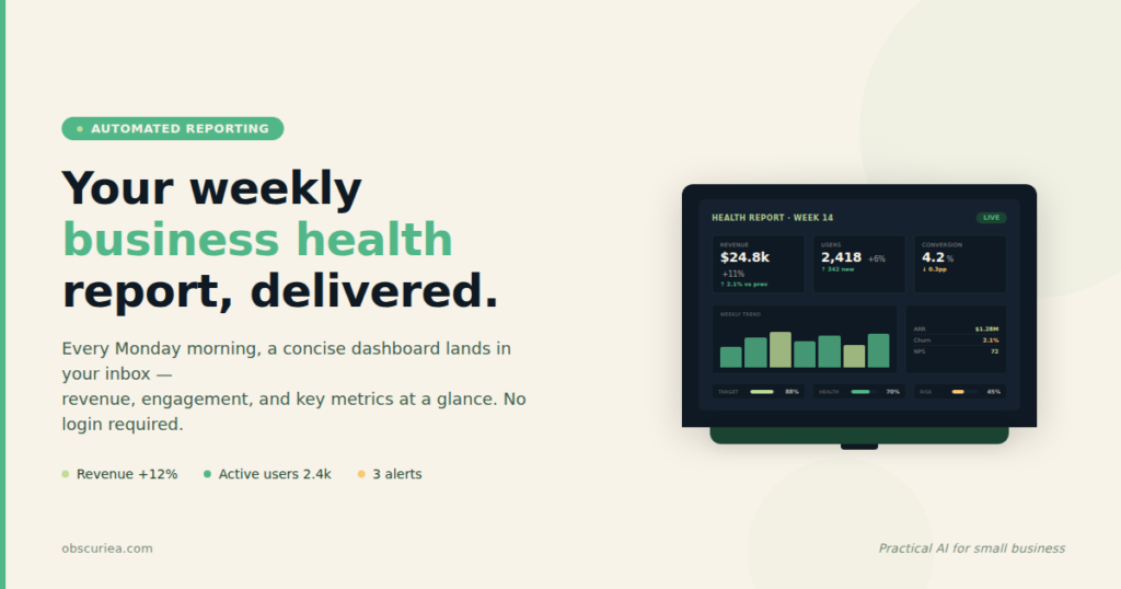
The core of an automated weekly health report is a data pipeline that collects metrics from your operational systems—CRM, accounting software, project management tools, analytics—and funnels them into a single template. At the end of the week, the pipeline generates a plain-language summary plus visual dashboard, then sends it to your inbox (and optionally to your team or stakeholders).
Most operators I’ve worked with start with a manual version of this: every Friday, they open five tabs, copy numbers, type a few bullet points, and email the result. That process is not just slow—it’s brittle. One person gets sick, and the report dies. One spreadsheet gets a typo, and a bad number makes its way to the board.
The automated alternative uses three layers:
1. Data aggregation: Pull from APIs or export data into a central spreadsheet or database.
2. Analysis and summarization: Use a script or AI to calculate trends, flag anomalies, and generate text.
3. Distribution: Schedule an email or dashboard publish.
You can build this with inexpensive tools: Zapier or Make for data movement, Google Sheets for storage, GPT API for summarization, and Gmail or Mailgun for delivery. The total monthly cost is under $100 at moderate scale.
The Workflow Math
Let’s put numbers on the before and after. I’ll use a typical small business with three core systems: a CRM (e.g., HubSpot), an accounting tool (e.g., QuickBooks), and a project management tool (e.g., Asana). They produce a weekly report for the CEO that covers new leads and win rate, revenue and expenses this month vs. last month, and active projects with overdue tasks.
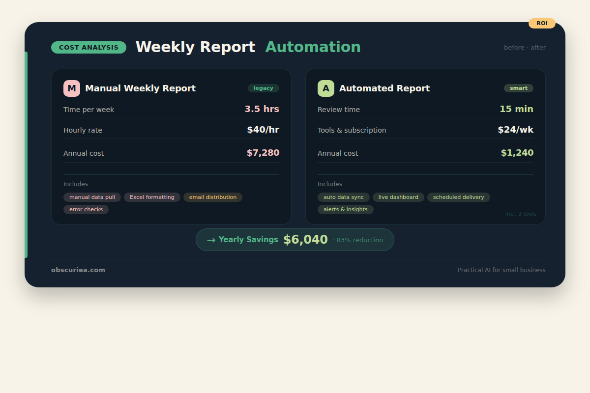
Before automation:
– Data collection: 2 hours (pulling reports from each system, formatting into a master sheet)
– Analysis and commentary: 1 hour (writing bullets, checking for outliers)
– Formatting and sending: 0.5 hours (making it look presentable, attaching PDF)
– Total: 3.5 hours per week
– Annual cost: 182 hours, or about $7,280 at a $40/hour blended rate
After automation:
– Setup time: 8 hours (one-time, to configure connectors and templates)
– Weekly review: 15 minutes (read the summary, correct any AI misinterpretation)
– Total ongoing: 13 hours per year, plus 8 hours setup in year one
– Annual cost after setup: $520 at $40/hour, plus tool costs of ~$60/month ($720/year)
Three-year savings: roughly ($7,280 – $520 – tool increment) * 3 = over $19,000. And that doesn’t count the cost of errors or missed insights.
Where It Breaks
Automated reporting sounds magical until it isn’t. Here are the failure points I’ve seen repeatedly:
- API changes: When your CRM updates its API, the connector may stop pulling data. You won’t notice until someone says “where’s the report?” Build in an alert: if the data doesn’t update within 24 hours, send a notification.
- Data cleanliness: Automated pipelines amplify bad data. If your sales team leaves lead sources blank, your report will show a big “Unknown” category. You need validation rules upstream.
- AI hallucination: If you use GPT to write the summary, it may invent numbers or trends. Always include a human review step, and limit the AI to strict templated summaries rather than open-ended analysis.
- Cost creep: Some API credits escalate with usage. Monitor your per-month cost and set a budget cap.
- Stakeholder trust: If the report goes completely automated and no one checks it, the CEO might start ignoring it. A short human review preserves credibility.
The Friction Box
- You must maintain the integrations; they are not set-and-forget.
- AI summaries need a human gatekeeper—never distribute automatically without review.
- Data quality problems become visible only when the report fails.
- The setup requires comfort with no-code tools and basic API concepts.
- If your business has more than five source systems, the complexity grows nonlinearly.
Frequently Asked Questions About Automated Weekly Business Health Reports
What tools do I need to automate weekly business reports?
You need a data connector (Zapier or Make), a spreadsheet or database (Google Sheets or Airtable), and a way to send the report (Gmail with a script, or a service like Mailgun). For AI summarization, you can use the GPT API or Claude API. The whole stack runs under $100/month.
How much does it cost to set up automated reporting?
Initial setup takes 8 hours of your time (or a freelancer’s time at $50-100/hour). Ongoing costs are roughly $60-80/month for API subscriptions. Compared to the 3-5 hours you spend manually each week, the payback period is about 4-6 weeks.
Can I send automated reports to clients automatically?
Yes, but be careful. If the report contains sensitive data, you need to control access. Use a tool like Google Data Studio or a password-protected dashboard link rather than attaching raw data. And always read the summary before it goes to a client—even if the data is correct, the tone may need adjustment.
How do I ensure data accuracy in automated reports?
Build validation checks at each stage. Compare totals against known thresholds, flag empty fields, and set up a weekly spot-check where you manually verify two to three numbers. Over time, you’ll learn which data sources are reliable and which need pre-processing.
What if my source systems don’t have APIs?
You can export data as CSV or Excel files and use a tool like Integromat to watch a folder. If nothing else, ask your vendor—many modern SaaS tools have APIs that are just not well advertised. As a last resort, a part-time data entry person costs far less than your current manual reporting time.
How long does it take to set up an automated reporting workflow?
For a report with three data sources and a simple summary, expect 6-10 hours of focused work. The first hour is the hardest—mapping fields and understanding the data model. After that, it’s configuration and debugging. Set aside a full day and you’ll have a working prototype by evening.
The Straight Talk
This system is for the business operator who currently spends 3+ hours every week cutting and pasting numbers into a report they barely trust. It’s not for someone who already has a dedicated BI team or an enterprise data warehouse.
If you’re serious about automating this, start with your most painful report. Map the data sources, pick two metrics, and automate those first. Extend once you prove the pipeline works. You’ll get back 3 hours a week that you can spend actually running the business.